Construction Criticism: North Science is a bland and directionless omen for college architecture
October 26, 2022

This is the first article of “Construction Criticism,” a column reviewing campus architecture.
Designing buildings for colleges is hard. They must not only be useful to students, professors, and the community, but also serve as physical manifestations of institutional values to advertise to prospective students, encourage donations from alums, and conform to a larger campus plan. The College finished construction on its newest building, North Science (alternatively Wachenheim), in 2021.
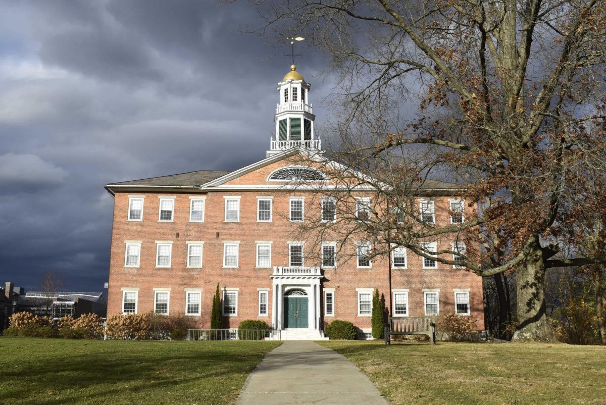
North Science inhabits the former site of Bronfman Science Center. Built in 1965, Bronfman, along with Greylock Quad, was the College’s first foray into modern architecture — both were designed by the same architecture firm, The Architects Collaborative (TAC). Bronfman shared its design language with the still-standing Greylock dormitories.
Originally, the proposed design for North Science took after Horn Hall and the Williams Inn with an unstylish blend of modern and classical styles, doing away with the beloved Bronfman’s tried-and-true, modest footprint. The marbleclad, hulking concept was met with community disdain. As a result, the first designer was fired and replaced with Payette Architects. Their new design was made with one clear guideline: Make it look as similar as possible to Bronfman.
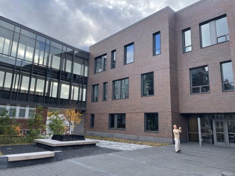
The similarities between North Science and Bronfman are apparent. To mimic Bronfman, Payette designed North Science’s elevation to be squat, used brick to build its facades, and even positioned windows where Bronfman originally had them (the extruded north window is identical). Like Bronfman, North Science aims to blend in with its context. To diminish its expressed size, Payette dug into the site to hide classrooms and a large, 200-seat auditorium underground and split the building into a series of cubic pavilions that both recede and advance. The result is a huge building that does not quite look monumental. North Science does away with the symmetry and order of Bronfman, replacing its language of banded concrete and grid windows with a random assortment of varying rectangular hole-punch windows.
Approaching North Science, one is met with multiple unimpressive facades that convey absolutely nothing about its purpose and meet the student with hazy confusion. Flat, grayish-red brick sides neither tower nor extend, offering neither orientation nor monumentality. For such a large building, North Science’s impression is shockingly punitive, perhaps even more so than Payette intended.
To boggle students further, North Science does not gesture toward an entrance. There are three main doorways, and each is impossible to find, hidden under extruded rectangles. These entryways would succeed in an urban setting, but here in rural Williamstown, this tactic is ineffective, considering that one might approach North Science from any direction. Frontality is needed to draw people in, but the building’s lack of frontispiece eliminates any gravitational pull it could have.
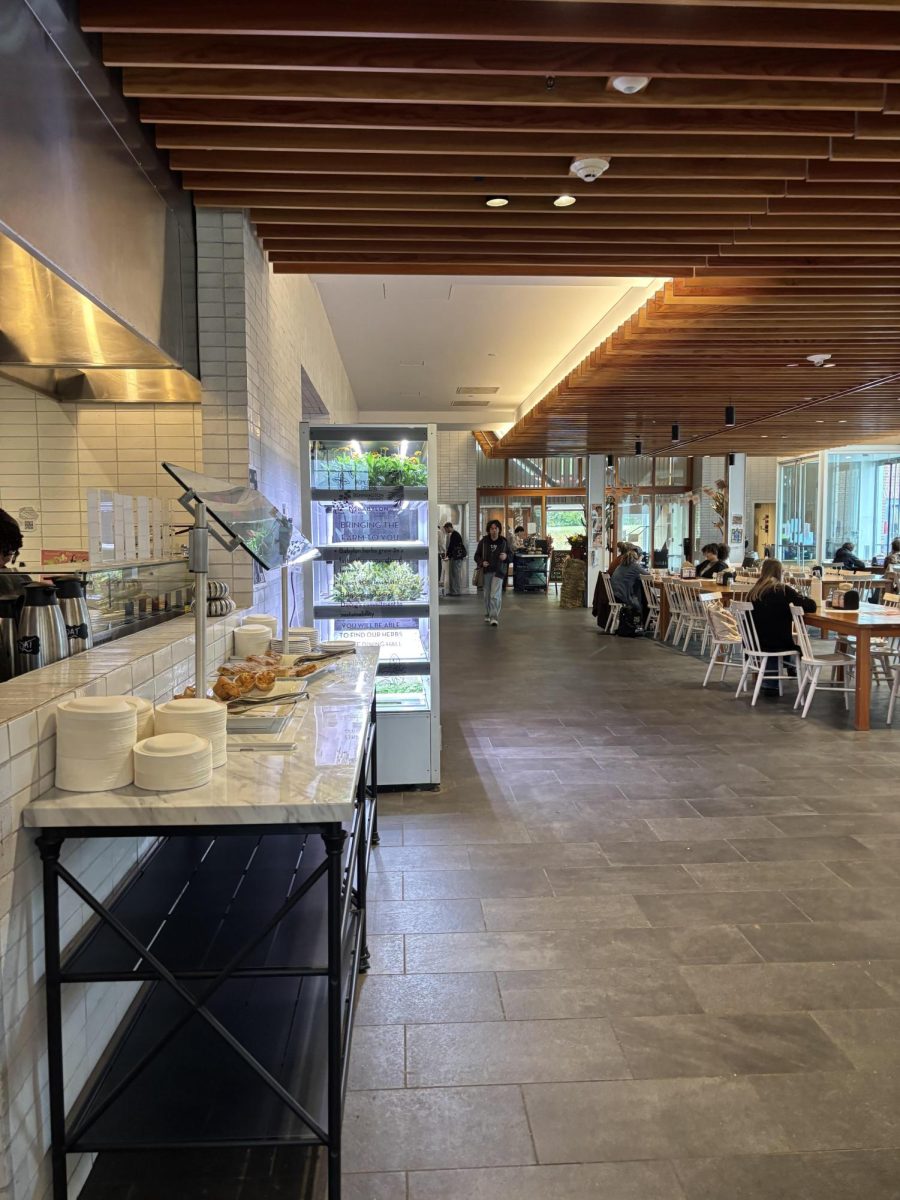
North Science’s interior is directionless: Regardless of which entrance is used, the visitor will be greeted with a labyrinthine set of white plaster hallways that limply gesture toward a central staircase. The staircase is not the hero it needs to be; a large architectural statement descending into an atrium would allow visitors to attach a sense of scale to their surroundings, whereas North Science’s is long, tall, and uninteresting. It directly passes into the ceiling with little space around it, hiding neighboring floors. Ascending the stairs only heightens disorientation, as each level is practically identical. The building feels like an infinitely generated maze of white walls, irregular wood-paneled ceilings, and polished gray stone floors, none of which reveal any orienting clues.
North Science’s common space is equally confusing. Medium-size study alcoves are granted windows (unlike the many classrooms in the basement floors that are not). The two main alcoves feature monumentally high ceilings and slightly not-square floorto-ceiling windows that are latticed with irregular beams into smaller rectangles. These windows are the only redeeming feature of these study spaces and tend to attract busy students between classes. Although the windows draw students in, a lack of intentionality in the study spaces feels unthoughtful and adds to an overwhelming sense of disorientation.
Colorful, diverse furniture (round tables with chairs, long couches, high tables, lounge chairs) is arbitrarily scattered around the study spaces, indicating that these rooms could be used for eating, studying, or talking. There are chalkboards, book cases, and plants, confusing students as to whether these are quiet study spaces or common rooms. As a result, students fluctuate between quiet and medium volume levels. North Science’s onespace-fits-all approach creates inconsistency. Time has revealed that students choose to study in these spaces, but confusing floor electric-outlet placements means that they must sporadically shift positions should they want charged laptops. There is no clear-cut decision as to what each study space is for, our only hint being balconies with silver Futura that spell “Psychology” or “Mathematics,” which offer little clarifying detail, only a suggestion of which professors’ offices are nearby. Of course, the common spaces are befitted with a shapeless edge-toedge gray carpet, exacerbating the feeling of gray monotony present everywhere in North Science.
At least the building is multi-functional. As home to math, psychology and geosciences departments, there are great office and laboratory spaces that are easy to find if you know exactly to which room you are going. The lack of direction, however, diminishes any efficiency in the floor plan, and a change in materiality or color from floor to floor (i.e. Greylock’s color-coded floors/railings!) or hallway to hallway would help better orient visitors.
Missing from North Science is any sense of wonder. Exploring its seemingly endless hallway will reveal no surprising features, no nooks, no crannies. North Science’s blandness is a part of a multi-year trend of clean, uninspired architecture at the College, like the uninteresting modern/colonial twins Hollander and Schapiro, or the aforementioned – and quite shiny – Horn Hall (hopefully, the upcoming Williams College Museum of Art plans evade this trend). Buildings like these remove the possibility for innovative, exciting architecture and eliminate wonder.
Ultimately, North Science leaves me fearful about the state of college architecture as an art form. The more we try to streamline it, the less we see it. Slowly, the less we focus on variety and the more we focus on uniformity, architecture starts to dissolve into ambiguity. We are left with uninspiring, unimportant structures that are as replaceable as they are new and efficient. Welcome to architectural hell: gray, repetitive, and infinite.
Reed Putnam ’23 is an art history & practice major from Mount Kisco, N.Y.


