Review: The Clark’s Hue & Cry exhibition treats viewers to sweet images of French color printmaking
February 9, 2022
The Clark Art Institute’s new exhibition titled, Hue & Cry, inspires an appreciation of French color prints through a confectionery of bright pastels and prints. Unlike the Clark’s most recent print-making exhibition, Competing Currents, which featured Japanese ukiyo-e aesthetics and techniques, Hue & Cry presented the newfound global commerciality of prints. Instead, Hue & Cry opens with the early fine-tuning of precise color imaging in the era leading up to the French Revolution.
I entered the first room, which was painted floor to ceiling in a pastel pink and contained a series of expensive prints commissioned by an upper class that displayed them as curiosities. One print, “Dance Mania” (1809), depicts a party attended by aristocrats, who have been contorted into ostentatious poses and wide grins, a facetiousness which contrasts the atmosphere of the French Revolution just ten years before.
The many uncredited hand colorists and artists that produced these pieces with a self-awareness of their cloyingly sweet sentiment and vanity. In the wake of the Revolution and the introduction of newfound aesthetic inspirations from Japan, artistic prerogative began to animate color printing nearly a century later.
Walking past a wall partition introduces the second room, this time painted light gray, which features softer and more intimate scenes between mothers and children as well as farmers and their nobly framed livelihoods. The century’s jump from the carefully outlined and realistic Neoclassical tradition to a new Impressionist influence hints at the arresting potential for artistic expression through restraint. Rather than appearing airless from the employment of blank space and simplified palettes, this restraint allows controlled punches of color to invigorate subjects. For example, Camille Pissarro’s print “The Plow” (1901), a frontispiece for an anarchist journal, portrays the interior life of a farmer, something distinct from the high romantic drama of the first few prints.
Excited by the polarity of perspectives displayed so far, I was ushered into the next room with the expectation of meeting a progression of the skillfully employed sky tones of Mary Cassatt and Camille Pissarro. Instead, I was met with a bright yellow triangle of what appeared to be posters — the kind of loud print you might see hanging in a homey Italian restaurant with history. Hue & Cry hits its stride with Henri de Toulouse-Lautrec’s and Jules Chéret’s bold array of color lithographs, which depict the exciting modern Parisian life of music house shows and flirtations on the street.
With the sacrifice of subtlety and the substitution of innuendo, the expression of the interior lives of Parisians manifests in the shadowy figures of flirtatious jesters. Toulouse-Lautrec’s depiction of the unwanted suitor of “The Englishman at the Moulin Rouge” (1892), in all his abstraction and planar grayness sent a jolt of electricity through me, and Chéret’s goblins and suitors allow for the jubilance of his girls to radiate through the sunshine-colored room.
The contemporary nature of the gray and yellow rooms was remarkable — the pieces in these rooms were all created from 1891 to 1901. The further abstraction of space in Toulouse-Lautrec’s and Chéret’s prints lends itself well to both the flattened, graphic nature of their advertisements, and also to color printmaking in its layered approach. It creates new expressive meanings for banked space.
The exhibition did a wonderful job making these prints doubly meaningful by calling attention to the art’s audience, and the voyeuristic nature of their contemporary perusal and appropriation.
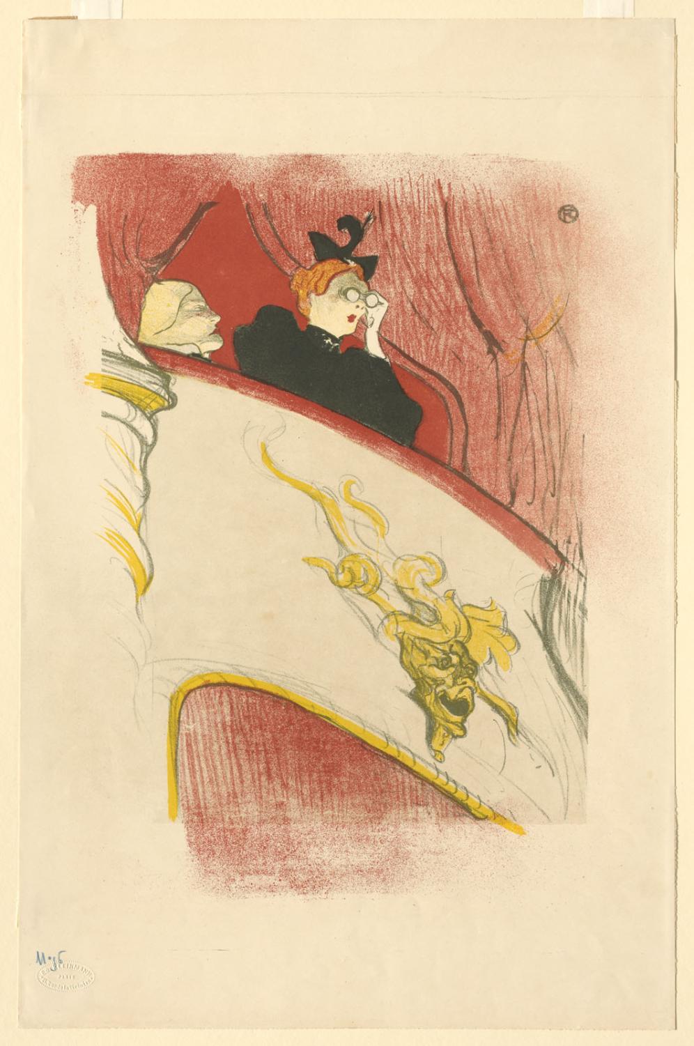
The ability of color printing to shock its contemporary audience, now interested in collecting these more widely accessible prints, manifests neatly in the careful restraint of the exhibit itself. One wonders why color prints were forbidden from exhibition at the Paris Salon until 1899 until they’ve stepped from the carefully trim depictions of country life in the gray room, and into the city’s bright allure of hedonistic escapes and hazily remembered nights. Toulouse-Lautrec’s “Balcony with a Gilded Grotesque Mask” (1894) peers into the next adjacent room with hawkishly pursed lips and fashionably garish opera glasses, and mirrors my feeling exactly.
My tour of the exhibition ended as quickly as it began, as I was led into the next room, painted in gray again. Hue & Cry begins to more deeply explore the divergent artistic visions planted in the first gray room. Adeptly paired lithographs prompt the visitor to ponder the manifold expressions of prints that share similar techniques, colors, and subject matters, but frame completely different emotions and perspectives.
The exhibit highlighted the medium of color printmaking as a whole and brings viewers in for a concerted lesson on the diverse capabilities of the medium. The hand of the curator is never more apparent, or rewarding. It is succinct and mechanical, and it provides a quality of sweetness to experience of savoring images that might otherwise really be ephemeral or untamed.
I stayed in the gray room as long as I could (the security guard reminded the sparse audience that the Clark was closing in 10 minutes) in front of Pierre Bonnard’s “The Orchard” (1899) and “Boating” (1897). Five lush shades of green bleed into each other in the foreground and transform the landscape into an enchanting scene of eternal summertime. A similar economy of color produces a fantastically picturesque meditation on water, otherwise white but rendered in green ripples, the same shade as the riverbank.
The final dark blue room displays four single-artist portfolios commissioned by art collector Ambroise Vollard. In this room, the exploration of printmaking methods in previous rooms is turned to the conceit of the very medium itself. Each of these four portfolios, centered on the rushes and visions of modern life, attempts to exemplify the essential form of printmaking — what can a lithograph express at its very core once it’s been distilled to its most emblematic characteristics? The portfolios displayed in the four rooms play into the abstractions and disjointed storytelling hinted at in the previous rooms.
Before I headed out of the Clark, I rested and appreciated the curator’s hand that shaped this saccharine journey through the colorful layers of every room.


