
Last fall, two Yale professors created “We Rate COVID Dashboards,” a website that evaluates the virtual dashboards that colleges across the nation have maintained during the pandemic in order to report data on the impact of COVID-19 at their institution.
For its sparse two-column table, Williams received a B-, which put the College among the lower third of the 369 schools on the list.
Amherst, on the other hand, was one of five institutions to receive the highest possible grade: an “A++”.
The website, which is now defunct, ranked schools’ dashboards according to nine criteria, including how easy they are to read, how often they are updated, and what kinds of data they report.
When the College’s dashboard was evaluated on Sept. 5, 2020, it was composed of four pieces of data: positive test results in the last 24 hours, positive tests in the last seven days, and tests completed in the last seven days and since Aug. 17, 2020. Also included were links to the CovidActNow pages for Berkshire County and the state of Massachusetts.
Up until last week, little about the dashboard had changed. It reported positive test results in the last seven days and since Aug. 17, 2020, with the latter figure including a breakdown of cases among students vs. faculty and staff. The dashboard also displayed the number of tests completed in the last seven days and since Aug. 17, 2020.
In light of the relatively smooth end to the spring semester, President Maud S. Mandel said she had initially hoped the College would be able to retire the dashboard by the start of this fall. But over the summer, when the administration began to recognize the need to account for the Delta variant in making plans for the fall semester, there was little doubt that the dashboard would remain up and running for another few months.
“It became clear that people in the community were going to need this data again,” Mandel said. “And I started to think that more information could help people feel more safe.”
As the fall drew near, Associate Director of Institutional Research James Cart ’05 updated the private dashboard his office used to regularly brief senior staff on COVID trends on campus.
“It turned out that 80 percent of that was stuff that they’re happy to share with the public, and that really we should have out there publicly,” Cart said. “So in building it for them, I always had in my mind that it would be nice to have something better than the table we had up there.”
Cart volunteered to give the public dashboard a facelift using the data visualization software Tableau. After spending “probably too much time reworking it and getting it ready,” he rolled out the finished product: an interactive table with two pages, each replete with color-coded graphs that are filterable by date range.
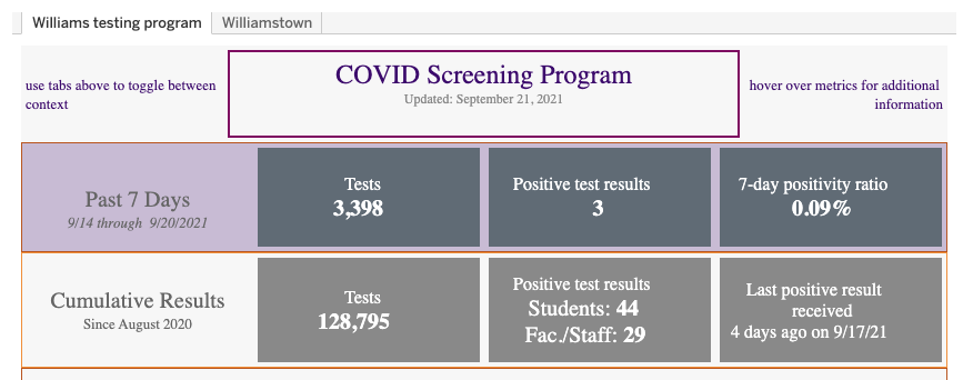
The first page, “COVID Screening Program,” reports the same information as the previous dashboard, along with the date of the last positive result and the seven-day positivity ratio, which is calculated by dividing the number of positive test results in the last week by the number of tests. Despite the dashboard’s new appearance, Cart said the information contained on that screen differs only slightly from what was available before the update.
“I think the biggest new thing is just the presentation,” Cart said. “In terms of the Williams-specific things, there aren’t really any new metrics there.”
The visualizations on the second page of the dashboard, titled “Williamstown in Context,” are entirely new. The page uses public data from CovidActNow and the Massachusetts Department of Public Health to display maps and graphs reporting COVID trends at the level of the county, tri-county, and state.
All told, the updated dashboard contains little information that hadn’t been publicly shared before. Its primary advantage over the previous version, Cart said, is the more sophisticated visualization, which brings the College up to the level of schools like Amherst or Smith College.
Some schools have chosen to share data that Williams keeps private, such as the number of students in isolation or quarantine. Mandel said the decision not to share such figures comes down to ensuring people’s privacy in a small community, along with wanting to keep the dashboard as uncluttered as possible.
“You can throw all the data out there, and some people love that,” she said. “But sometimes it’s not actually that helpful.”
The decision to exclude isolation and quarantine data means the dashboard will again lose a point even if the new iteration receives an updated rating from “We Rate COVID Dashboards.” But while it may never attain the same score as Amherst’s, Mandel said, “I think the dashboard gives you a sense of what [senior staff] have been following, in a way that I hope is useful to the community, so that they can learn not only about our own campus, but about the region and the state.”