The early days of WSO: When Williams students claimed a corner of the World Wide Web

In his role as Professor John Keating in Dead Poets Society, Robin Williams leads his class to a display case with pictures of students from long ago, exhorting those in his charge to listen closely so they can hear their predecessors whispering their legacy. “Carpe diem” is what Keating tells his students they might hear from their forerunners. Seize the day.
Put your ear to the digital display case that is Williams Students Online (WSO), and you are likely to hear something slightly less inspirational: “this is like a test thingy message.”
Those were the rousing words that began the first recorded message ever posted to WSO, at 8:23 p.m. on Jan. 27, 1997, by a mysterious student known only as Jonah W. His post went on to say:
so there was once a guy who tried to post a message
to the www bulletin board, but he failed Ha!
Let’s see if this works
Thanks to the Internet Archive’s Wayback Machine, Jonah’s inaugural WSO message — and a treasure trove of other content — is preserved like a digital time capsule, recording over 25 years of Williams students’ online personalities.
Founded in 1995, Williams Students Online is a student-run website that can be accessed today by any student with an active Williams login. Over the course of its history, WSO has boasted features such as discussion forums, listservs, a rideshare platform, and even weather reports for students at the College.
While the site is known today for the various services and resources it currently provides to students — like Factrak, for reviewing professors, and Facebook, for finding peers’ hometown and profile picture — hidden beneath the familiar purple and white homepage lie innumerable snapshots of the past. With even the earliest WSO web pages still accessible via the Internet Archive, the site is like a portal into the past, revealing the personalities, interests, hopes, and insecurities that students left behind.
‘Eyecatching’
The favicon (the small square image that represents a website in web browser tabs) and title bar of the earliest versions of WSO display a single word, “eyecatching,” which would be an understatement when describing the site of the late ’90s.
When launched in 1995 by DeWitt Clinton ’97 and John Kim ’98, with help from Jon Zeppieri ’97, Jason Gladstone ’97, and Jessica Mintz ’98, WSO was hosted on a single Apple Power Mac 7100 running WebStar, a server that held about one sixty-thousandth the computing power of a cheap laptop today. By today’s standards, the design of the site itself would be considered equally archaic. In a word: it was messy.
“Throughout its iterations, web design has shifted towards a minimalist ethos compared to the 1990s, where it was much more cluttered,” current WSO President Aidan Lloyd-Tucker ’22 said.
The 1997 WSO homepage greets the user with an ominous hand emblazoned with an eye in the center of its palm. The hand’s fingertips are adorned with icons representing the various services that were then available on the platform. And, as if the site wasn’t already screaming its age, below the hand was a link imploring users to “Burn a CD.” The rest of the screen’s real estate is reserved for high contrast GIFs, colorful hyperlinks, and hand-drawn images characteristic of the early Internet aesthetic.
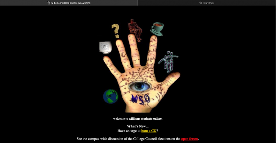
Compared to the modern iteration of the site, where students are met with a simple discussion board and navigation bar set in front of a neutral purple and white background, the WSO of the 1990s is almost alien in construction. Indeed, ’90s web design was built on the rule that there were no rules. “Part of the reason why you had so much quirky personality from web pages in the 1990s is that there were no standard expectations of what a web page would look like,” recounted Shimon Rura ’03, a member of WSO who led one of the principal redesigns of the site’s forums in the spring of 2003. “People would put whatever stuff they wanted to.”
The student network
One of the primary features of the early versions of WSO were the class pages. From 1997 to 2001, WSO gave each student the chance to create their own webpage within the site, which could be accessed through the class facebook or site directory.
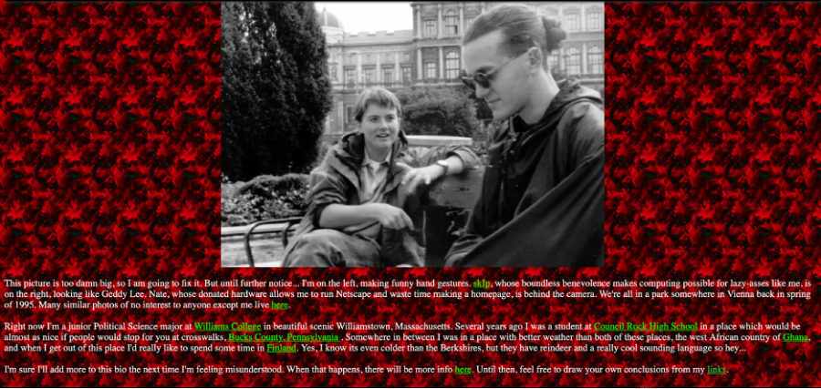
As a result, hundreds of links were created during those five years, with HTML-knowledgeable students making their own personal WSO-hosted websites. The webpage of Tanya A. ’98, for example, boasts a GIF of a blinking Waffle House sign, under which are several reflections titled “Rants” about her time at the College, along with a link to a short bio.
The bio page is set against a red, patterned background with bright green hyperlinks, making the interface something of a headache to view on today’s high-contrast computer screens. “Right now I’m a junior Political Science major at Williams College,” her bio reads. “I’m sure I’ll add more to this bio the next time I’m feeling misunderstood.”
The page was never updated again.
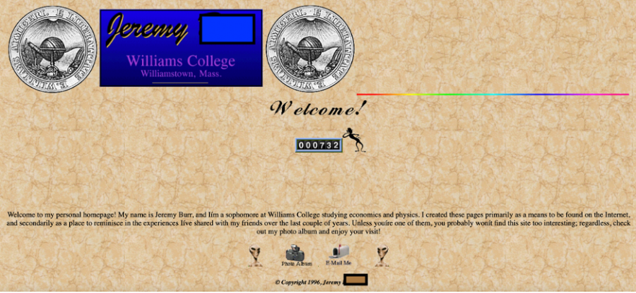
The webpage of Jeremy B. ’99 boasts a more achromatic palette, sporting various Williams icons and a homemade logo. A still-active visitor counter, now at 732, will continue to tick for eternity as long as his site is accessible to the public through the Archives. Jeremy states his site’s purpose in a short mission statement: “I created these pages primarily as a means to be found on the Internet, and secondarily as a place to reminisce in the experiences I’ve shared with my friends over the last couple of years,” it reads. “Unless you’re one of them, you probably won’t find this site too interesting; regardless, check out my photo album and enjoy your visit!”
Some sites, however, like one made by Helena J. ’00, take themselves even less seriously.

Above all, these individual webpages were curated to fit the personalities and tastes of each individual student. The early iterations of WSO, both within these individual pages as well as on the site as a whole, were built to feel homegrown and organic.
Students were allowed to craft a digital space of their own. There were no design rules or terms of service. Indeed, the early WSO site afforded a way for students at the College to set up their own, sometimes quirky but always personalized corner of the budding World Wide Web.
Recalling this enchanting aspect of the early Internet, Rura noted, “I created a website on my mom’s university Unix in 1997, idling up to it from a very slow modem at home, and I found it really inspiring to think I could take some pictures, write some words, and put them up in some place that anyone could access.”
Lost in translation
Once a staple of Williams culture, the current iteration of WSO serves as a hub for tools and services to be used by students. “Every iteration of the website has reflected what WSO meant to the campus at that time,” Lloyd-Tucker said.
It is perhaps not surprising, given the advent of mass market social media platforms that allow people to create a digital image with relative ease, that a creative, albeit complex, platform like the early iteration of WSO is absent today — no longer needed by the campus population.
Today’s social media platforms have obvious user interface improvements, but as is the case with things that evolve and mature, there is an inexorable march towards standardization. On Instagram, for example, you have to adhere to a character limit and a prescribed image resolution. The early pages of WSO were free from word counts and file sizes, allowing people to more easily inject their own personality into their online presence, making it distinctive and special. While you don’t need to know HTML to make an Instagram profile, that also means there is less opportunity to create a truly unique, individualized online presence.
Strangely, what was standard for WSO a quarter century ago has renewed relevance today, as we live in a world shaped by a pandemic that limits our personal contact, prevents us from communicating with facial expressions, and restricts our ability to introduce ourselves to others. In an environment like that, a digital space unfettered by the character constraints of a Tweet or an Instagram bio may be more valuable than ever.


