
EpheliYUCK: From font overload to evil Ephelia, new visual identity misses the mark
February 10, 2021
On Feb. 3 at 11:49 a.m. EST, the Williams community received what could be described as the only bad Jim Reische email ever, containing a link to the new Williams visual branding. Scrolling through identity.williams.edu, I have a lot of opinions regarding this new visual identity and they are generally … not positive. While I do think that the designs are heading in an interesting direction, such as the attempt to modernize the College’s aesthetics with an expanded color palette and minimalist designs, the visual design team dropped the ball on this one.
Let’s start with the typography. I’ll begin by saying that while I’m a bit of a font snob, I have no issues with Eph Serif and Eph Slab. They’re both visually appealing serif fonts, with Eph Serif representing the traditional and professional aspect of Williams and Eph Slab being more unusual and showing off a more contemporary, friendly, and lively aspect of the community. Generally, a reliable rule to follow in typography is to pair serif fonts with complementary sans serif ones, using one for headings, titles, and emphasized words and the other for body text. Of course, there are exceptions to this rule, but it’s typically a good idea to pair contrasting font families together in a way in which the heading font draws attention and conveys a specific ethos and the body text is readable and straightforward, secondary but complementary to the heading font.
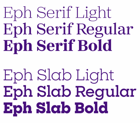
The issue with the new Eph fonts is that none of them pair well together to create varied visual experiences. The two fonts I praised above are nice on their own but are too similar in their font families to pair in a visually appealing way. The new Williams rebranding is missing a solid Sans Serif font that can pair with these bold heading fonts. While the branding seems to use Eph Gothic as its body text, which does, admittedly, work just fine with Eph Slab, Eph Gothic is not a true sans serif font. Now, I’m not a big fan of sans serif fonts in general anyway, so the pairing of Eph Slab with Eph Gothic looks good to me. However, the combination of Eph Serif with Eph Gothic falls into a sort of typographic uncanny valley, as the two fonts are too similar but are ultimately different. The serifs on the two fonts are of a similar family, but Eph Gothic is undeniably more rounded.
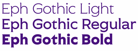
The pairing of these two fonts gives off a “Wait are these the same font or different? I can’t really tell but it makes me uncomfortable…” kind of feeling. Of course, anyone can pair these main fonts with a good Helvetica or any other classic sans serif font, but if the goal of the branding was to establish a distinct Williams identity, I think it’d be in the College’s best interest to have a unique Eph sans serif font that isn’t Eph Octic. We’ll get to Eph Octic.
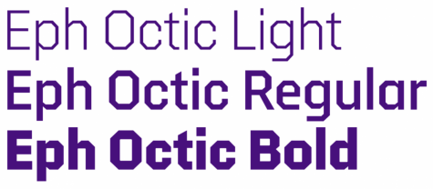
Eph Octic is ugly. There’s nothing good I can say about it. It’s ugly. I get that they were going for one of those bold varsity fonts, but this missed the mark in so many ways. While the bold version of Eph Octic achieves the varsity font aesthetic, reading the other versions of Eph Octic feels like vertigo. The octagonal shape creates weird angles that make it seem like my computer screen is glitching out and distorting a normal bold font to the point where it’s disorienting. It looks like the letters are wiggling.
My last issue with the typography involves the Williams Area of Study designs. Because the “Williams” and “area of study” texts are so close together and in the same boldface font, it looks too visually cramped. This is one of those times when it would be good to pair a bold font with a lighter one, or at least separate the text boxes a bit.

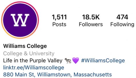
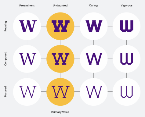
And just a side note related to the typography: What’s with the off-centered “W”s? When the College’s official Instagram account changed its profile picture, people were displeased by how off-centered the “W” was. At the time, I assumed that it was a result of Instagram cropping, but judging by the icons presented on the branding website where many of the “W”s are not centered within the circle, it seems that was intentional.
Now, let’s get to the most egregious visual change on this website: Ephelia. O, Ephelia. What did they do to you? Of course, I’ve heard complaints about the old Ephelia design, usually centered around her dislocated ankles or her massive udders, but old Ephelia is a proud matriarch. She’s an icon. Look at her pose as she glances behind her towards the camera with a cheeky and defiant grin while her tail drapes gracefully and coyly around her absolute dump truck.

New Ephelia looks like a cryptid you’d see before a bridge collapse. She has this Mothman-esque bad-omen vibe, and the reason for that lies in her eyes. Her eyes are so unsettling. She looks a little evil. There’s a disturbing glint in those eyes. She doesn’t look determined or fierce or defiant, but possesses an air of malice. Old Ephelia is cheeky in the way that your vivacious friend would be while acting silly, making a joke, or partying. New Ephelia looks like your five-year-old cousin coming to tell you that she shoved a chocolate chip cookie into the disc player on your computer and spilled Spaghetti-Os on the keyboard. She says it was an accident but that look in her eyes tells you that it was completely intentional and that all she desires is to cause problems. Then, she’d assume that fighting pose to mock you while your mom yells at you for the mess.
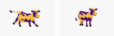
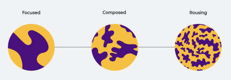
It seems that the graphic design team couldn’t quite decide between cute Ephelia and fierce Ephelia and instead created this abomination. I do appreciate the varied poses and facial expressions, and I do agree that the old Ephelia design felt dated, but this development was not the solution. Her cow spots don’t even look like spots. The cow print pattern looks like it would grace the musty soda-and-vomit-stained carpet of a laser-tag arena in the early 2000s. The “rousing” version of the pattern makes me feel like I’m in biology class looking at proteins and bacteria with wiggly shapes floating in the background medium. It just doesn’t look cow-like. I like the concept of an unlined, modern redesign of our beloved Ephelia, but this was just not it.
Of course, there are more important things to complain about than this new visual branding, and with time, we will all get used to the changes and grow to embrace these new elements. It seems to me that the graphic design team made a genuine effort to revitalize Williams’ visual identity and I think the visual rebranding is on the right track, but the parts where it falters are painfully apparent and disconcerting, such as evil Ephelia.
Besides, it seems the graphic design team was generally disconnected from the opinions and aesthetic of the students. Take a look at any RSO visual branding, student artwork, or any visual product of this community and you’ll see that this attempt to capture the entire ethos of Williams College, especially in regards to Ephelia and the cow branding, was just that: an attempt, halfway successful but generally missing the mark.