College refreshes visual identity, students push back with memes
February 5, 2021
Goodbye, #FDCC09. Hello, #FFBE0A.
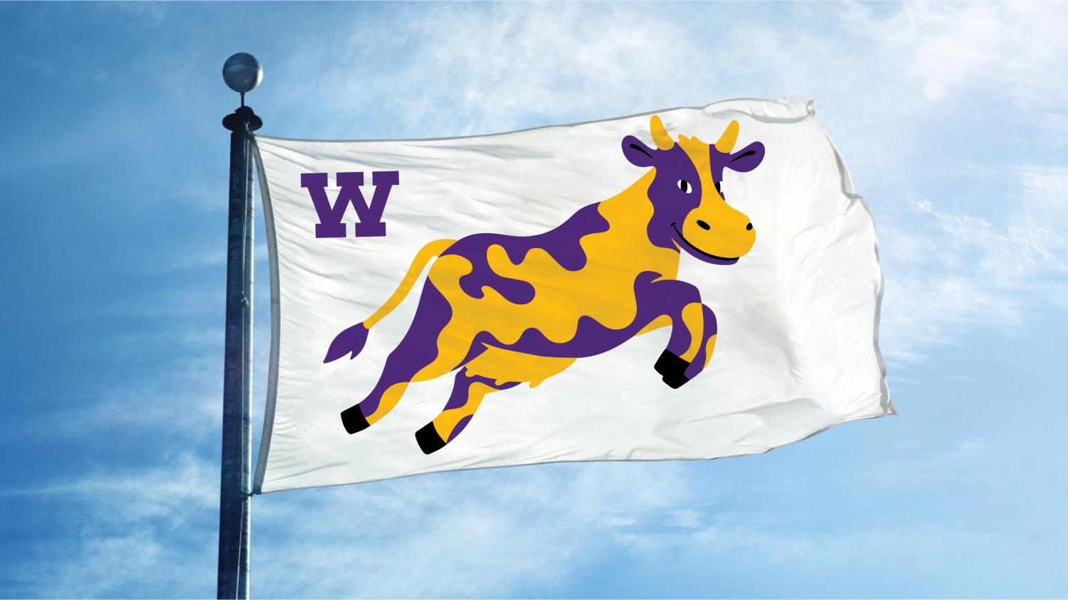
Chief Communications Officer Jim Reische and Associate Vice President for Communications Meike Kaan announced on Wednesday that the Office of Communication has updated the College’s visual identity. The change will replace and expand the official standards governing the College’s brand, from colors to typefaces, and from letterheads to the cherished Ephelia logo.
The announcement sparked a swift, impassioned, and largely critical response from students and alumni, who flooded Williams-related Facebook pages with memes and other posts, many of which expressed disapproval over the new, alternative rendition of Ephelia.
Reische said in an interview with the Record that the update will keep the College’s graphic standards in line with its current values and identity as an institution. He stressed the difference between a modest “refresh,” like this project, and a more involved “rebrand,” explaining that his office aims to subtly shift the College’s visual identity but “isn’t fixing something that’s broken.”
“No visual identity can or should try to capture every aspect of a multi-faceted place like Williams,” Reische wrote in the email announcing the change. “But over time we hope people will see this identity as evocative of something distinctive about Williams’ character.” Reische and Kaan also unveiled a new web page centered around the College’s visual identity.
The Office of Communications began the project in August 2019, aligning with the College’s strategic planning schedule so that ideas and themes coming out of strategic planning could inform their design.
The first step was a research process in which the College worked directly with graphic designer Jesse Reed of Order Design, a small Brooklyn studio that helped to develop the core identity system for Hillary Clinton’s 2016 presidential campaign, which was centered on Michael Bierut’s iconic H logo. (The studio’s other clients have included MoMA and Kickstarter.)
Reed’s team and the communications office had more than 200 conversations with students, faculty, staff, and alums, in an attempt to follow through on the principle that, as stated on the new identity website, “our visual identity is a reflection of the people, place, and spirit of Williams College.”
As part of the research process, designers dug through College archives containing merchandise, sporting tickets, yearbooks, and admissions materials to identify classic colors, fonts, and cows from years past. They also toured the Berkshires, looking to draw additional font and color inspiration from local businesses and scenery. “The environment and physical location of the College are so influential on who we are and what we do,” Kaan said.

The design team felt it was important to “know the history before you make any changes,” Kaan said. One of the major conclusions they came to during the research process was that there is vast diversity at the center of the College’s identity, granted by its people, its surroundings, and its curriculum.
In light of that diversity, Reische and Kaan said they hoped to avoid putting forward a narrow or prescriptive vision of the College’s identity. “Williams contains multitudes,” Reische quipped, so its visual identity would need to reflect that.
Reimagining Ephelia
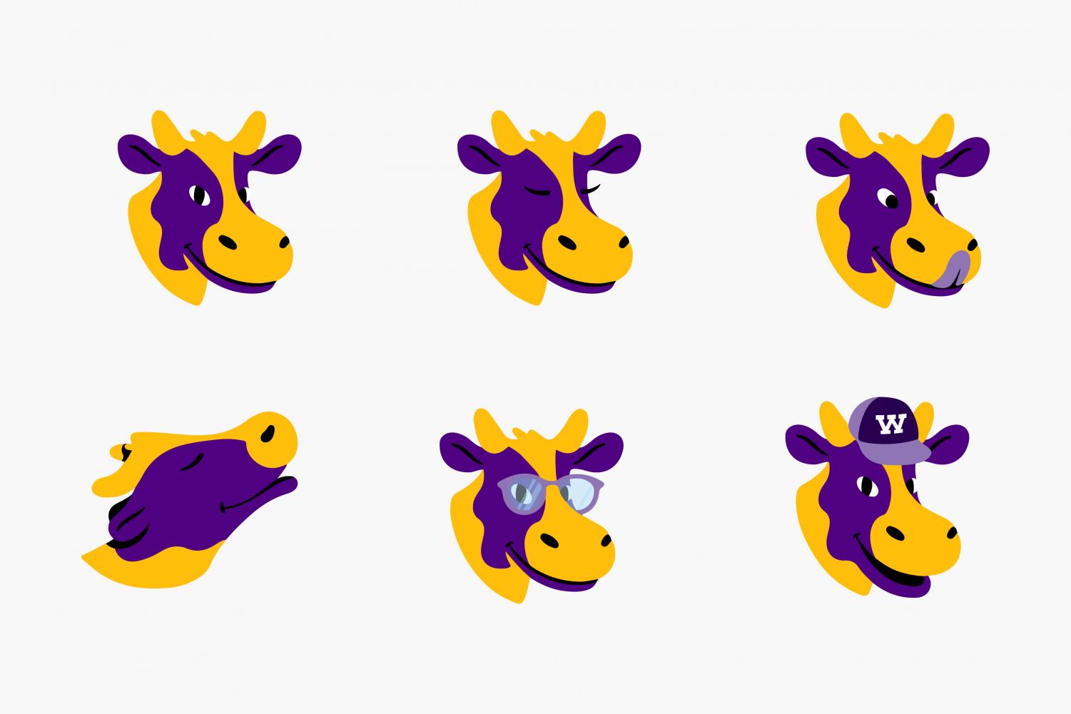
One change was far more striking — and controversial — than the rest. Ephelia was never in danger of being replaced as the College’s mascot, according to Reische, but she received a makeover, gaining a more splotchy spot pattern and smoother features.
Kaan made clear that the new Ephelia is not intended to be the definitive rendition. “The expectation is not that there will be one; there never has been just one Ephelia,” she said. “It’s not like that’s the only one you can use. We’re eager to have individualized depictions of Ephelia.”

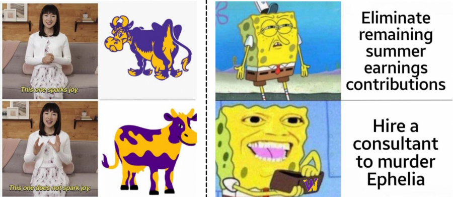
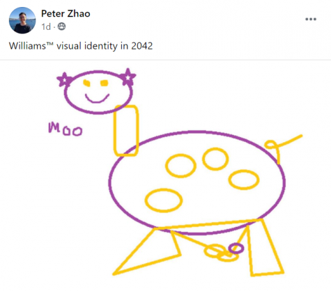
Still, students and alumni pushed back forcefully against the new interpretation, with many taking to the “Williams Memes for sun-dappled tweens” and “You know you went to Williams College if…” Facebook groups to post satirical responses to the update.
Surabhi Iyer ’21, via meme, accused the update of “laying waste to ephelia,” capturing a broadly shared sentiment. Joseph Grillo ’24, meanwhile, created a Change.org petition calling on the College to “allow Williams Students the chance to submit and vote on a new cow.” The petition had 48 signatures at press time.
“The decision to change the Ephelia was made without asking pretty much anyone, and was obviously shortsighted as to the reaction of students and alumni who have grown to love Ephelia,” Adam Jones ’21 told the Record. “Also, the new Ephelia literally looks like a children’s cartoon.”
Reische and Kaan said they knew from the start that certain elements of the update would rub community members the wrong way, as has likely been the case whenever the College changed its visual identity throughout history. “Every one of those [typefaces and logos] was once new, and there were probably people who liked it or didn’t like it,” Reische said. “Now, through the mists of nostalgia, they look back, and they’re like, ‘Oh, that’s so Williams.’ We’ll get there with this stuff, too.”
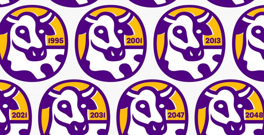
In conducting research, the design team found that people hold a diverse range of attitudes toward different versions of Ephelia. Kaan said they concluded that there was room for flexibility in how Ephelia is represented; in other words, the College community is “loyal to the cow, but not necessarily this cow,” she said.

Colors
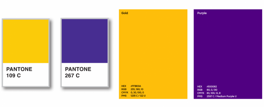
An element of the graphic standards that became more diverse after the update is the College’s color palette. Slightly deepened shades of the classic purple and gold are joined by black and white in the primary palette, while four new colors comprise the extended palette: dark purple, magenta, ocher, and orange.
Kaan and Reische were quick to affirm that purple and gold will always remain the colors of the College.
“When they get here, not everybody loves the color purple, but people come to see it as somehow emblematic of something about this place,” Reische said. “They develop an attachment to it as symbolic of Williams in some way.”
The purple became a bit warmer, but the difference is subtle. Kaan said there was a time when the College used the exact same shade of purple as Amherst, but the new update pushes the two even further apart. (“Not that that was a goal,” Kaan said. “It wasn’t not a goal,” Reische added.)
Fonts and Typefaces
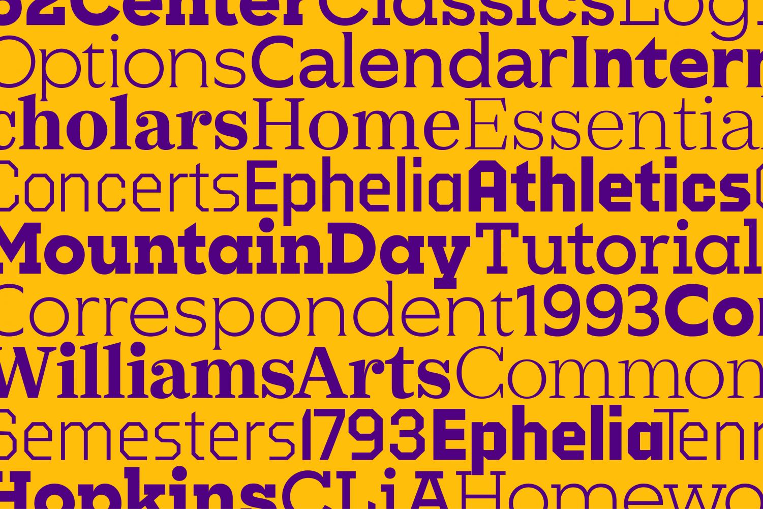
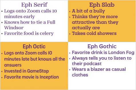
The update also includes a new “typographic identity” with four custom fonts — Eph Serif, Eph Slab, Eph Gothic, and Eph Octic — that come in three “volumes” (Light, Book, and Bold).
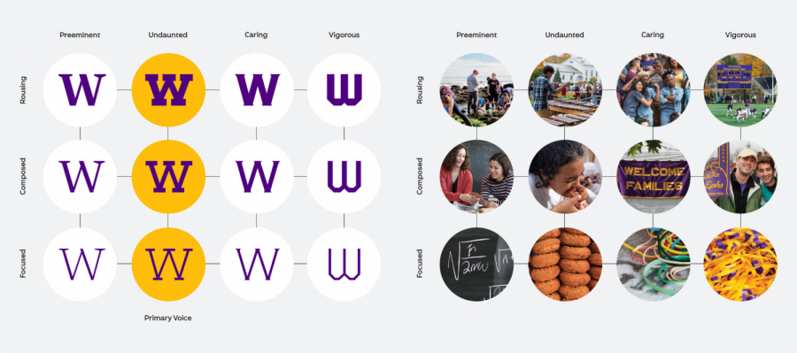
Kaan said the Eph Slab font, which they used for the College’s wordmark (its text-only logo), is rooted in styles from College history and is more “friendly, contemporary, playful, and simple” than fonts used by peer institutions.
Students’ criticism of the visual identity extended past the new Ephelia. Rosa Kirk-Davidoff ’21 posted a meme in the Facebook group that satirizes the attributes that each font is meant to embody by assigning them further personality traits and characteristics.
The “Eph Type Family,” as the set of fonts is called, is unique to the College, and Kaan said other colleges typically use just one font, rather than a school-specific font family.
Brand extensions
The College will shift away from relying solely on the word “Williams” to constitute its wordmark, extending it in some cases to read “Williams College.” Although the previous wordmark projected “strength and confidence,” Kaan said, the College’s name is not universally recognized, so the clarity will help on student ID cards for those traveling or hoping to get student discounts. “The confidence doesn’t help you when you’re presenting in Spain or in Jordan and nobody knows what Williams is, so having that option available is helpful,” she said.

The transition to the new visual identity will be gradual, as well as environmentally and financially sustainable, Reische and Kaan said. Any materials displaying old graphics will be used up, not thrown out, before transitioning to the new fonts and colors.
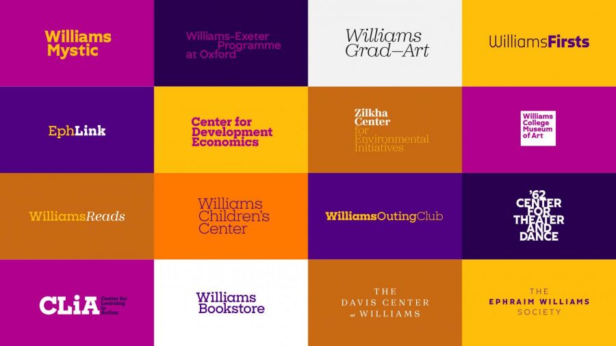
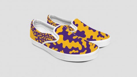
The set of graphic standards will inform designs for all kinds of merchandise, promotional content, and communications materials.
At the end of the day, Reische said, the visual identity is meant to reflect the College and will always be interpreted in light of observers’ pre-existing opinions about the College. “If people come [to the College] and they have a really good experience, then eventually, over time, the typefaces and colors will come to represent that experience, and it will be positive,” Reische said. “What we hope is that over time, people who love Williams will become used to this, and will learn to see how it represents something about the institution.”

